Collapsible 3 Panel Layout
This documentation concerns how to set up and configure the Collapsible 3 Panel Layout, which is actually a collection of components that work together to provide an experience that looks like the following picture:
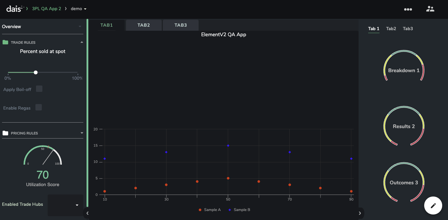
In this picture, we can see all the components working together:
- The
CollapsibleThreePanelLayoutis the base layout which provides the sliding drawers - The
ControlSectionare the vertically collapsible areas in the left-hand panel of theCollapsibleThreePanelLayout. These typically contain functional levers, and are also visible and able to be interacted with when the left drawer is closed. This is shown in the picture below. - The
Canvascomponent, which is the centerpiece of the app. It has tabs that are able to be configured by the creator. - The
Detailscomponent, which sits in the right-hand drawer of theCollapsibleThreePanelLayout. This contains tabs which are able to be interacted with when the drawer is closed.
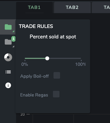
The above picture shows how the ControlSection can be interacted with when the left panel of the CollapsibleThreePanelLayout is collapsed.
Initial setup
In order to get an app set up with this collection of components, it is recommended to start with the following base app configuration:
{
  "packages": [
    {
      "name": "dais-ui-builder-elementv2",
      "type": "modular",
      "common": false,
      "version": "1.7.0-elementv2.0"
    }
  ],
  "apiVersion": 4,
  "configuration": {
    "components": {
      "a1": {
        "name": "Layout Root",
        "props": {
          "children": ["collapsible3Panel"]
        },
        "widgetId": "V4LayoutRoot"
      },
      "root": {
        "name": "Store",
        "props": {
          "children": ["a1"]
        },
        "widgetId": "V4Store"
      },
      "canvas": {
        "name": "Canvas",
        "widgetId": "DaisCanvas"
      },
      "details": {
        "name": "Details",
        "props": {
          "tabs": {
            "type": "value",
            "value": [
              {
                "id": "tab1",
                "label": "Tab 1"
              },
              "Tab2",
              "Tab3"
            ],
            "parsei18n": false
          },
          "children": {},
          "selectedTab": {
            "path": "details.selectedTab",
            "type": "link",
            "store": "stateNotPersisted"
          }
        },
        "widgetId": "DetailsTabs-lbt"
      },
      "collapsible3Panel": {
        "name": "Collapsible 3 Panel",
        "props": {
          "views": {
            "path": "views",
            "type": "link",
            "store": "stateNotPersisted"
          },
          "lhsWidth": {
            "type": "value",
            "value": "13rem"
          },
          "canvasChild": ["canvas"],
          "selectedView": {
            "path": "view",
            "type": "link",
            "store": "stateNotPersisted"
          },
          "lhsOpenDefault": {
            "type": "value",
            "value": true
          },
          "rhsOpenDefault": {
            "type": "value",
            "value": true
          },
          "detailsChildren": ["details"],
          "controlsChildren": []
        },
        "widgetId": "CollapsibleThreePanelLayout"
      }
    },
    "rapidVersion": 10,
    "defaultInputs": {},
    "defaultOutputs": {},
    "defaultStateNotPersisted": {
      "view": "Overview",
      "views": ["Overview", "Detail", "Inputs"]
    }
  },
  "scenarioType1": {
    "layout": {
      "id": "V4Root"
    },
    "newScenarioModal": {
      "copySelection": {
        "enabled": true,
        "copyObjects": ["scenarioinputs", "scenariooutputs", "scenariometa"]
      },
      "modelSelection": {
        "enabled": true,
        "optional": true,
        "selectionType": "Docker"
      }
    },
    "superRequiresSubmission": false
  },
  "scenarioOptions": {
    "default": "scenarioType1",
    "options": [
      {
        "id": "scenarioType1",
        "icon": "chart",
        "name": "Test"
      }
    ]
  },
  "disableDefaultPencil": true
}
This provides the following:
- A UI builder version which supports functionality required to make the components work (called
ElementV2) - A component hierarchy which includes the
CollapsibleThreePanelLayoutconfigured in such a way that theCanvasandDetailscomponents are correctly placed and set up with sensible defaults
Currently, you will need to contact a member of the Dais team and ask that this specific version of the UI builder be deployed to your app:
{
  "name": "dais-ui-builder-elementv2",
  "type": "modular",
  "common": false,
  "version": "1.7.0-elementv2.0"
}
Note that in the future, there may be more recent versions of the UI builder that support this functionality. In this case, simply set the recommended name, common and version parameters of the UI builder package that you wish to use.
Components
CollapsibleThreePanelLayout
Properties
Show View Switcher Dropdown / Current View / Available Views
The view switcher dropdown is a select menu, which when configured to be visible, appears in the top-left corner of the app:
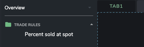
By default, every Dais app is configured to have three views, denoted by the views property in the UI Only data store. By default these are:
OverviewDetailInputs
Selecting a view with the view switcher dropdown, by default, will populate the view property in the UI Only store with the selected value. This can be used in tandem with ViewSwitcher components to render entirely different content based on the selected view, as chosen by the user.
(Control / Details) Panel Width
Control Panel Width and Detail Panel Width define the width of the Control (left) and Detail (right) panels of the 3 Panel Layout, respectively, when either panel is open. Any valid CSS measurement is able to be specified, and it is recommended to use either rem (such as 20rem) or px (such as 200px) as units for configuring these properties.
(Control / Details) Default Open
Boolean flags that specify whether the Controls or Details panels should be open by default when the app is initially loaded.
ControlSection
Properties
Title
The Title property defines the text that is shown at the top of the ControlSection component when visible in the expanded Controls panel. In this example, Trade Rules is the title:

When the Controls panel is collapsed, the Title property is used to give a title to the popover that is shown when the user clicks on the ControlSection's icon:
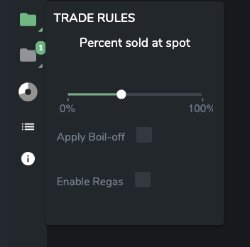
Note that the title is always capitalized by the component.
Icon
The Icon defines the icon that is visible in the expanded control section(next to the title), or in the clickable box for the collapsed view which opens the popover. When configuring the icon, the user is presented with a set of icons to choose from in the UI builder interface.
Start Open
When visible in the expanded control panel, ControlSections can be either open or closed by clicking on the title.
Start Open is a boolean flag defining whether the ControlSection will be open by default when the user opens the app.
Badge Text
When collapsed, ControlSections can optionally show a colored badge with text that can be configured. Any valid string may be input here, although it is recommended to keep the badge to 3 characters or less. In this case, a ControlSection has been configured to have Badge Text of 20%:

Canvas
Properties
Tab Labels
The Tab Labels property expects an array of strings, which will become tabs at the top of the central canvas.
Selected Tab
Defines which tab the canvas will open to when the user opens the app for the first time. Also allows the content in the canvas to be programmatically switched when Selected Tab is linked to a dynamic value in the store.
Footer Enabled
Enabling the footer will cause an area to appear at the bottom of the canvas, into which UI builder elements can be placed. It is the perfect place to put controls that are so intuitive that they need no label, such as a date slider that controls a single chart shown in the canvas.
In the case where the canvas contains a lot of independent widgets, it is recommended to not use a footer, as it may be unclear what the component in the footer is meant to do.
Details
Properties
Tabs
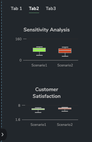
Tabs defines the list of tabs that are shown to the user in the Details panel. These are able to be specified as a list of strings or objects containing an id and label. An example configuration could be:
[
  {
    "id": "tab1",
    "label": "Tab 1"
  },
  "Tab2",
  "Tab3"
]
In the case where the selected tab needs to be controlled by data within the app (or the selected tab should drive some other functionality based on which tab is selected), it is recommended to use {id, label} objects, since it allows a decoupling between the tab's ID and the label which is ultimately displayed.
The above configuration produces tabs that look like:
Selected Tab
Defines which tab the details will open to when the user opens the app for the first time. Also allows the content in the details to be programmatically switched when Selected Tab is linked to a dynamic value in the store.
Note that the value here would be the id when tabs are configured in {id, label} form.